
Trying to assess a program's success without first defining what "success" actually means is a recipe for disaster. It's like setting out on a road trip with no map and no destination. You’re definitely moving, but are you getting any closer to where you need to be? The real starting point isn't gathering data; it's getting crystal clear on what a win looks like for your program. This ensures every action you take from here on out has a purpose.
Defining Success Before You Start Measuring

Before you can even think about tracking progress, you have to build a solid assessment framework that goes way beyond vague hopes. Meaningful assessment demands a deliberate, structured plan for what you want to achieve. Getting this initial groundwork right guarantees that your entire process for assessing program outcomes is focused, strategic, and ultimately capable of proving real impact.
It all begins with talking to your key stakeholders. Why? Because "success" often looks very different depending on who you ask.
- Funders and Donors: They're often looking for a clear return on their investment. That could mean tangible community impact, cost savings, or hitting specific metrics tied to their funding agreement.
- Program Participants: For them, success is deeply personal. It might be landing a new job, securing stable housing, or simply feeling a stronger connection to their community.
- Program Staff: Your team on the ground sees the day-to-day. Success might look like running the program efficiently, seeing high participant engagement, and having a manageable workload.
- Community Leaders: They're looking at the bigger picture—things like reduced crime rates, improved public health, or a boost in local economic activity.
When you bring these different perspectives together, you start to build a much richer, more accurate picture of what your program is truly trying to accomplish.
From Vague Goals to Clear Objectives
Once you have that stakeholder input, it's time to translate those big-picture ideas into clear, measurable objectives. A goal like "improve literacy" is a great starting point, but you can't measure it. You need specific targets that leave no room for interpretation.
This is where the SMART goal framework becomes incredibly useful. It forces you to make sure your objectives are:
- Specific: What, exactly, do you want to achieve?
- Measurable: How will you track progress and know when you've succeeded?
- Achievable: Is this goal realistic given your resources?
- Relevant: Does this objective directly support your program's core mission?
- Time-bound: What's the deadline?
Using this, a vague goal like "improve literacy" transforms into something powerful: "Increase the average reading comprehension score of program participants by 15% within one academic year." Now that's a target you can work toward and measure. This level of clarity is especially critical for nonprofits, as shown in this detailed case study on https://unify.scholarfundwa.org/case-study/program-evaluation-for-nonprofits.
To build a strong foundation for assessing your program's outcomes, it's essential to have a few key elements in place from the very beginning. This table outlines the core components that provide the necessary clarity and purpose.
| Key Elements of a Program Assessment Framework || :--- | :--- | :--- || Component | Description | Example || Clear Mission | The overarching purpose of your program. | To provide job training and placement services for unemployed adults. || Stakeholder Input | Gathering perspectives from all relevant groups (funders, participants, staff). | Conducting focus groups with past participants to understand their experience. || SMART Objectives | Specific, Measurable, Achievable, Relevant, and Time-bound goals. | To place 70% of program graduates in full-time jobs within 3 months of completion. || Key Indicators | The specific data points you will track to measure progress toward objectives. | Employment rate, average starting wage, job retention at 6 months. |
Having these components defined upfront prevents confusion later and ensures everyone is aligned on what you are trying to achieve and how you'll measure it.
Map Your Journey with a Logic Model
Think of a logic model as a visual roadmap that connects everything your program does with the results you hope to see. It’s a brilliant tool for making sure your daily activities are directly linked to your long-term goals. This map helps everyone, from funders to front-line staff, see the clear cause-and-effect chain—from the resources you put in to the impact you create.
A classic mistake is getting stuck on reporting activities ("We held 10 workshops") instead of outcomes ("75% of workshop attendees demonstrated a new skill"). A logic model forces you to connect those dots and keep your eyes on the results that actually matter.
This kind of structured thinking isn't just a good idea; it's a best practice that informs how you structure your goals. To really understand what drives success, especially in educational programs, it helps to dig into the science behind student outcomes. Understanding the evidence helps you build a much stronger, more effective program from the ground up.
Choosing the Right Data Collection Methods
Once you’ve defined what success looks like for your program, it’s time to gather the evidence. This is the part where you roll up your sleeves and pick the right tools to collect the data that will prove your impact or, just as importantly, show you where to improve.
The methods you land on will hinge entirely on the questions you're trying to answer. Some questions demand hard numbers, while others need personal stories and experiences to be fully understood.
The Power of Quantitative Data
Quantitative data is all about the numbers. It gives you concrete, measurable evidence that's usually straightforward to analyze and present. This kind of data is perfect for answering the "what" and "how many" questions about your program.
Think of it as the scoreboard. It provides clear, objective metrics on performance and scale.
Some go-to quantitative methods include:
- Surveys with Closed-Ended Questions: Using multiple-choice, rating scales (e.g., 1-5), or simple yes/no questions lets you gather data you can easily count up. For instance, asking, "On a scale of 1 to 5, how confident are you in your new skills?" gives you a clean data point.
- Pre- and Post-Tests: This is a classic for a reason. Testing participants before and after a workshop or training allows you to precisely measure the change in their knowledge.
- Administrative Data: This is the data you're probably already collecting—things like attendance records, program completion rates, or job placement numbers. Tapping into this is often one of the most efficient ways to track outcomes.
These methods give you a clear snapshot of performance. For example, a youth coding bootcamp might report that 85% of graduates passed their final skills assessment. That's a powerful, quantitative outcome.
Uncovering Insights with Qualitative Data
While numbers tell you what happened, qualitative data tells you why. This approach is all about gathering descriptive, non-numerical information that provides the depth, context, and nuance that numbers alone can't capture.
Qualitative methods are your key to understanding the real human experience behind the data and uncovering those "aha!" moments.
A few popular qualitative methods are:
- In-Depth Interviews: A simple one-on-one conversation can be incredibly revealing. It’s your chance to dig deep into a participant's journey, their motivations, and the challenges they faced.
- Focus Groups: Bringing a small group of participants together can ignite a dynamic discussion, highlighting shared experiences and diverse perspectives you might not get otherwise.
- Open-Ended Survey Questions: Even just adding a "Why?" or "Can you tell us more about that?" to a survey can yield invaluable context that brings your quantitative data to life.
For instance, a mental health program might learn from interviews that while their services are highly effective, transportation to the clinic is a major barrier. That’s a critical insight that a purely quantitative survey would likely miss.
Pro Tip: Always put your participants first when choosing your methods. Make sure your approach is respectful of their time, culturally appropriate, and accessible. A long, complicated online survey isn't going to work for everyone.
The Best of Both Worlds: A Mixed-Methods Approach
Honestly, the most robust program assessments almost always combine quantitative and qualitative data. This mixed-methods approach gives you a complete, 360-degree view of your program's true impact. You get both the "what" and the "why."
The image below really drives this point home, showing how these two data types work together to tell the full story.
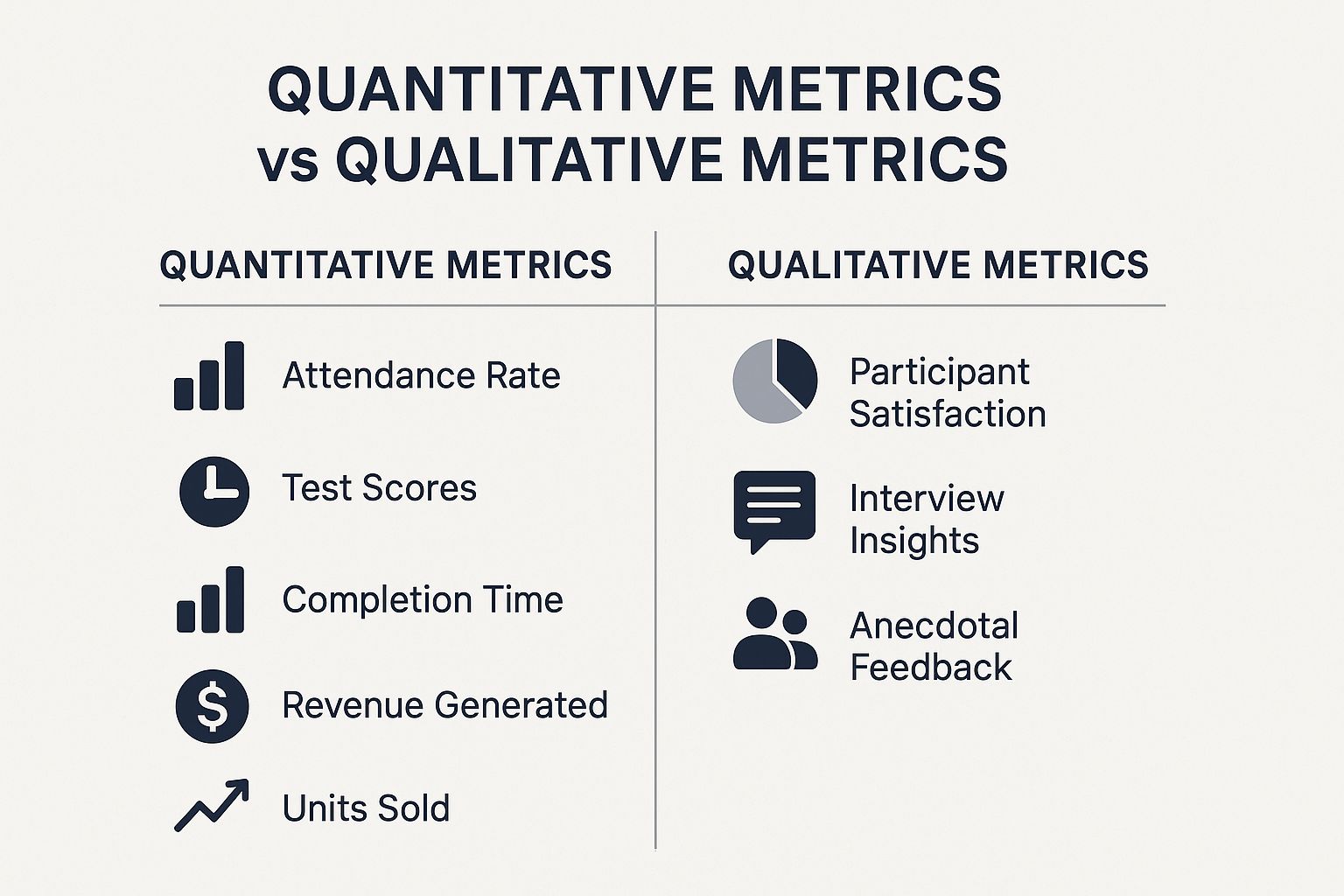
As you can see, the numbers track tangible results like test scores, but the qualitative feedback is what captures the human element—satisfaction, personal stories, and critical context.
Let’s look at a quick table to break down some of the most common options.
Comparison of Data Collection Methods
Here’s a comparative look at common quantitative and qualitative data collection methods to help you decide which approach best suits your program assessment needs.
This table is just a starting point. The real magic happens when you combine these methods.
Imagine a workforce development program. Your surveys (quantitative) might show a solid 70% employment rate post-program. That's great, but it's only half the story. Through interviews (qualitative), you could discover that participants felt the resume-building workshop was the single most critical factor in their success. Now you have a clear, actionable insight for improving your program.
This idea of mixing data sources for a clearer picture is a global best practice. For a recent data refresh, the UNESCO Institute for Statistics (UIS) integrated national population data from 76 countries to get a more accurate read on educational indicators. This allowed for a much more reliable assessment of progress toward global development goals.
To make gathering all this information easier, especially if you have teams working in different locations, exploring the top field data collection apps can be a game-changer. In the end, your choice of methods should always be driven by your key questions, your budget, and the compelling story of impact you want to tell.
Turning Raw Data into Actionable Insights

Collecting data is one thing, but the real magic happens when you transform those raw numbers and notes into a story about your program's impact. This is where your spreadsheets, interview transcripts, and survey responses come alive.
Don't let the idea of "data analysis" intimidate you. You don't need a Ph.D. in statistics to do this well. With a clear head and the right approach, you can pull together both the numbers and the narratives to build a complete, honest picture of what your program is achieving.
Making Sense of the Numbers (Quantitative Data)
Let's start with your quantitative data—the hard numbers. The goal here is to spot trends, measure change, and summarize your findings cleanly. For most program evaluations, a simple spreadsheet tool like Excel or Google Sheets is all you need.
Here are a few foundational techniques that deliver powerful results:
Frequencies and Percentages: This is often the most straightforward and impactful way to present data. How many people finished the program? What percentage felt more confident afterward? A simple statement like, "82% of our participants found stable housing within three months," is clear and powerful.
Averages (Mean): This is your best friend for pre- and post-test data. If you measure knowledge before your workshop and again after, you can calculate the average score for both. Seeing an average score jump from 65 to 85 provides tangible proof of learning.
The Midpoint (Median): Sometimes, a few extreme data points (like very high or very low incomes) can throw off your average. The median gives you the true middle value, which can be a more accurate representation in these cases.
These basic calculations form the backbone of your quantitative story. They provide the concrete evidence needed to demonstrate your program's effectiveness. To see how this works in a real-world context, this case study on measuring program effectiveness offers some fantastic, practical examples.
Finding the Stories in the Words (Qualitative Data)
Now for the qualitative data—the interview transcripts, focus group notes, and open-ended survey answers. This is where you find the rich context and the human experience behind the numbers. Analyzing this kind of data is less about counting and more about interpretation.
We often call this process thematic analysis. Think of yourself as a detective, sifting through clues to find connections and recurring ideas.
Here’s a simple way to get started with coding:
- Get a Feel for It: First, just read through a sample of the responses. Don't try to analyze yet—just absorb what people are saying.
- Tag Key Ideas: Go back through and start highlighting interesting phrases or powerful quotes. Assign a short label or "code" to each one. For example, a comment like, "For the first time, I felt like someone was actually listening," could be coded as "Felt Heard."
- Group Your Codes: Once you have a list of codes, look for patterns. Do certain codes keep appearing together? You might find that "Felt Heard," "Supportive Staff," and "Safe Space" all point to a larger theme you can call Positive Relational Support.
This turns a collection of individual comments into meaningful, overarching insights about your program.
Key Insight: Don’t be afraid of the "messiness" of qualitative data. The most powerful findings often come from unexpected quotes or stories that challenge your assumptions and reveal what truly matters to your participants.
The Power of Bringing It All Together
The most convincing program assessments never rely on just one type of data. The real confidence comes from triangulation—the practice of cross-referencing your findings from different sources to see if they tell the same story.
Imagine your survey data (the numbers) shows a 90% satisfaction rate. That's great!
But then you dig into your interview notes (the stories) and discover that participant after participant mentioned how the one-on-one mentorship was the "most valuable part" of their experience.
Now you can connect the dots. Instead of just reporting the number, you can confidently say: "Our program achieved a 90% satisfaction rate, and our qualitative data strongly suggests the personalized mentorship was the key driver of this success." This is so much more compelling because it connects the "what" (the rating) with the "why" (the mentorship). It’s this balanced approach that creates a credible, undeniable narrative of your program's impact.
How to Tell Your Program's Story with Data
So you’ve crunched the numbers and analyzed the feedback. You might feel like the hard part is over, but there’s one crucial step left: telling the story of what it all means. This is where your data comes to life. Effective reporting turns raw information into a persuasive narrative that can justify your budget, inspire your team, and show everyone the real impact of your work.
The goal isn't just to dump facts and figures into a document. It’s about crafting a compelling story about your program's journey. Doing this well requires a bit of art and a structured approach to sharing what you've learned.
Building an Assessment Report That Gets Read
A great report doesn't just present information; it guides your reader on a journey. It should take them from the "why" of your assessment all the way to the "what's next." While there’s no single rigid template, a powerful report almost always contains a few key ingredients.
- Executive Summary: Think of this as the one-page snapshot. It’s often the only part a busy executive or board member will read, so make it count. It needs to concisely cover the program’s purpose, your most important findings, and the top recommendations.
- Methodology: You have to briefly explain how you got your data. This is all about building credibility. A simple sentence stating you used a mixed-methods approach, combining survey data with participant interviews, shows your work was thoughtful and rigorous.
- Key Findings: Here’s the heart of your report. This is where you lay out your most critical results. The trick is to blend the hard numbers (quantitative data) with the human stories (qualitative insights).
- Actionable Recommendations: Don't just point out problems—propose concrete solutions. Each recommendation should be specific, practical, and flow directly from a finding you’ve already presented.
This structure ensures your report is both thorough and easy for anyone to digest, which is critical when you have a lot of different people you need to reach.
Know Your Audience, Tailor Your Message
A one-size-fits-all report is a recipe for being ignored. The real key to making an impact is knowing who you're talking to and what they actually care about.
A funder, for instance, probably wants a high-level brief that screams return on investment (ROI). They need to see the big-picture impact and feel confident their money made a difference. Your program team, on the other hand, needs to get into the weeds. They'll want a detailed breakdown of the findings to understand what worked, what didn't, and how they can improve things on the ground.
Before you type a single word, ask yourself this: "Who am I writing this for, and what do they absolutely need to know?" Answering that simple question will shape everything—from your tone to the data you highlight—and make your communication ten times more effective.
Making Your Data Memorable
Let's be honest, raw data can be boring and overwhelming. The fastest way to make complex information click is through data visualization. A clean, simple chart can communicate a trend much faster than a dense paragraph of text ever could.
You don't have to be a graphic designer. Just use the right tool for the job:
- Bar Charts are perfect for comparing outcomes between different groups.
- Line Graphs are fantastic for showing change or progress over time.
- Infographics can give a brilliant, high-level summary of your program's biggest wins.
But visuals are only half the battle. To really make an impact, you need to bring your data to life with storytelling. Share a powerful case study about a single participant whose life was changed. Sprinkle in a few compelling participant quotes to give the numbers an emotional, human connection. This is what makes your impact feel real.
This kind of clear, transparent reporting is exactly what massive global initiatives do. Take the Programme for International Student Assessment (PISA), which assesses 15-year-old students in 81 countries. By publishing comprehensive findings on subjects like math and science, PISA helps countries see where they stand and what they can improve. They combine hard data with clear reporting to tell a powerful story about the state of education worldwide.
Using Your Findings to Fuel Improvement

Let’s be honest. The whole point of assessing program outcomes isn't to create a fancy report that gathers dust on a shelf. The real magic happens when you take those findings and use them to spark real, meaningful change. This is where your data stops being just numbers and becomes a practical tool for making your program better.
This final step is what turns a one-off assessment project into a living, breathing cycle of learning and refinement. It's about creating a solid feedback loop that encourages your team to reflect honestly and act strategically.
Facilitating Learning and Action Sessions
Once your report is ready, the first thing to do is get your key people in a room. But this isn't a lecture. Think of it as a collaborative "learning session" with your team and stakeholders, designed for open dialogue.
Your goal here is to create a safe space to dig into the results, celebrate the wins, and bravely face the areas that need work. It's crucial to frame the conversation around opportunity, not blame.
Try steering the discussion with thoughtful questions that get people thinking:
- Celebrating Success: "What do these wins tell us about our team's strengths? What parts of our program are really connecting with people?"
- Understanding Challenges: "Where did we see results we didn't expect? What could be going on behind these numbers?"
- Exploring Root Causes: "This finding points to a possible hurdle for our participants. What underlying factors might be at play here?"
When you approach the data with genuine curiosity, you completely change the dynamic. It shifts from feeling like a performance review to becoming a hands-on, problem-solving workshop. This builds incredible buy-in and empowers everyone to be part of the solution.
The most compelling reason to talk about program outcomes is because they represent a promise made to your participants. This should be the central motivator for any organization that prides itself on being participant-centered and focused on impact.
Prioritizing Your Next Moves
Your assessment will almost certainly uncover more potential improvements than you can possibly tackle at once. Trying to fix everything at the same time is a recipe for getting nothing done. The secret is to prioritize with purpose.
A simple but incredibly effective tool for this is the Impact/Effort Matrix. It helps you sort every recommendation based on two straightforward criteria:
- Potential Impact: How much will this change actually improve our key outcomes?
- Required Effort: How much time, money, and staff energy will this take?
This quick analysis helps you bucket your potential actions into clear categories, making it much easier to decide where to focus your energy first.
Using a framework like this ensures you're putting your limited resources where they'll make the biggest difference for your program and its participants.
Building a Concrete Action Plan
With your priorities locked in, the final piece is a solid action plan. A great idea without an owner and a deadline is just a wish. Your action plan is what turns insight into action.
For every single priority, you need to spell out:
- The Specific Action: What exactly needs to be done?
- The Owner: Who is personally on the hook for getting this done?
- The Timeline: What’s the deadline for completion?
- The Resources Needed: What budget or support is required?
- The Success Metric: How will we know, concretely, that we've succeeded?
This structure builds accountability and makes everything transparent. It moves the conversation from, "We should really do something about this," to, "Alex will launch the revised onboarding process by Q3, with a goal of increasing participant retention by 10%."
By embedding this cycle—reviewing findings, prioritizing actions, and executing a plan—you create a true learning organization. This commitment is the heart of making data-driven decisions. To see how others are doing this, you can learn how other organizations have used data analytics for nonprofits to push their missions forward. This is how you transform program assessment from a chore into the engine that fuels your continuous growth and amplifies your impact.
Your Questions, Answered
When you're deep in the trenches of running a program, stepping back to assess it can bring up some tricky questions. It's one thing to understand the theory, but putting it into practice is another challenge entirely. Let's walk through some of the most common questions I hear from teams on the ground.
How Often Should We Actually Be Assessing Our Programs?
Honestly, there’s no one-size-fits-all answer here. The right rhythm really comes down to the nature of your program and what resources you're working with.
For a program that runs continuously all year, aiming for a big, comprehensive assessment annually is a great rule of thumb. This gives you a solid, big-picture look at your impact and helps you spot trends from one year to the next. But if you’re running something shorter, like a 12-week workshop, a pre- and post-assessment is non-negotiable. You need to capture that immediate before-and-after snapshot.
The real goal is to find a consistent, predictable schedule that works for you. Maybe that means quick quarterly check-ins on your most important metrics, followed by a major deep dive every year or two.
The big idea here is to stop thinking of assessment as a rare, one-off event. When you weave it into your regular operations, you build a culture of learning and improvement. It shows you're committed to getting better, not just proving you were right.
What Happens If We Find Out the Program Isn't Working?
It’s a tough pill to swallow, but discovering your program isn't hitting its goals isn't a failure—it's a goldmine of information. Frankly, these findings are often far more useful than a perfect report because they tell you exactly where to focus your energy.
First things first, take a breath and check your work. Before you jump to conclusions, review how you collected and analyzed your data. Was your sample size too small to be meaningful? Could a survey question have been misinterpreted? Make sure the data is telling you a true story.
Once you’re confident in the findings, get your team and key stakeholders in a room for an honest, no-blame conversation. Think of these "negative" results as a gift. They can help you:
- Challenge and fix flawed assumptions you had about your participants.
- Uncover major roadblocks in how the program is delivered.
- Realize you might have been measuring the wrong things all along.
This is your chance to pivot, redesign, and build a program that's stronger, more resilient, and genuinely effective. This is how the best programs evolve.
How Can We Do This with a Tiny Budget?
This is probably the most common hurdle I see, but a small budget should never be a roadblock to meaningful assessment. You don't need fancy software or a big research team to get incredible insights. You just need to be smart and a little scrappy.
Your strategy should be all about simple, high-impact, low-cost methods.
- Embrace Free Tools: Platforms like Google Forms or the free version of SurveyMonkey are fantastic for creating and sending out professional-looking surveys.
- Use What You Already Have: You're probably sitting on a treasure trove of data already—attendance sheets, intake forms, even simple case notes. Dig into that administrative data and look for patterns.
- Go Deep, Not Wide: Instead of a giant survey, try conducting a few small focus groups or a handful of in-depth interviews. The rich, detailed stories you'll gather from a representative sample can be more powerful than hundreds of shallow responses.
The most important advice? Narrow your scope. Don't try to measure ten different outcomes at once. Pick the 2-3 most critical indicators that truly define success for your program and focus your efforts there. A small, sharply focused assessment that you can actually complete is worth infinitely more than a huge, ambitious one that falls apart halfway through.
Ready to move beyond spreadsheets and manual tracking? Unify by Scholar Fund provides a robust platform to design, manage, and report on your assistance programs with ease. With real-time data analytics and automated reporting, you can measure your impact transparently and focus on what truly matters—your community. See how Unify can transform your program management.


View more case studies


Powering Benefit Programs at Scale


